
Project Brief
Logo design for a Real-Estate Brand named Hari Group, based in Gujarat, India. The requirement was for the Wordmark to be in Gujarati text and with a Lotus beside it.
Project Timeline – 5 days
Brand Industry – Real Estate
Target Audience – New Home for Family – Luxurious yet Affordable Living.
Process – Comprehend – Research – Sketch & Ideate, Vectorize and Make-It-Real with Mockups
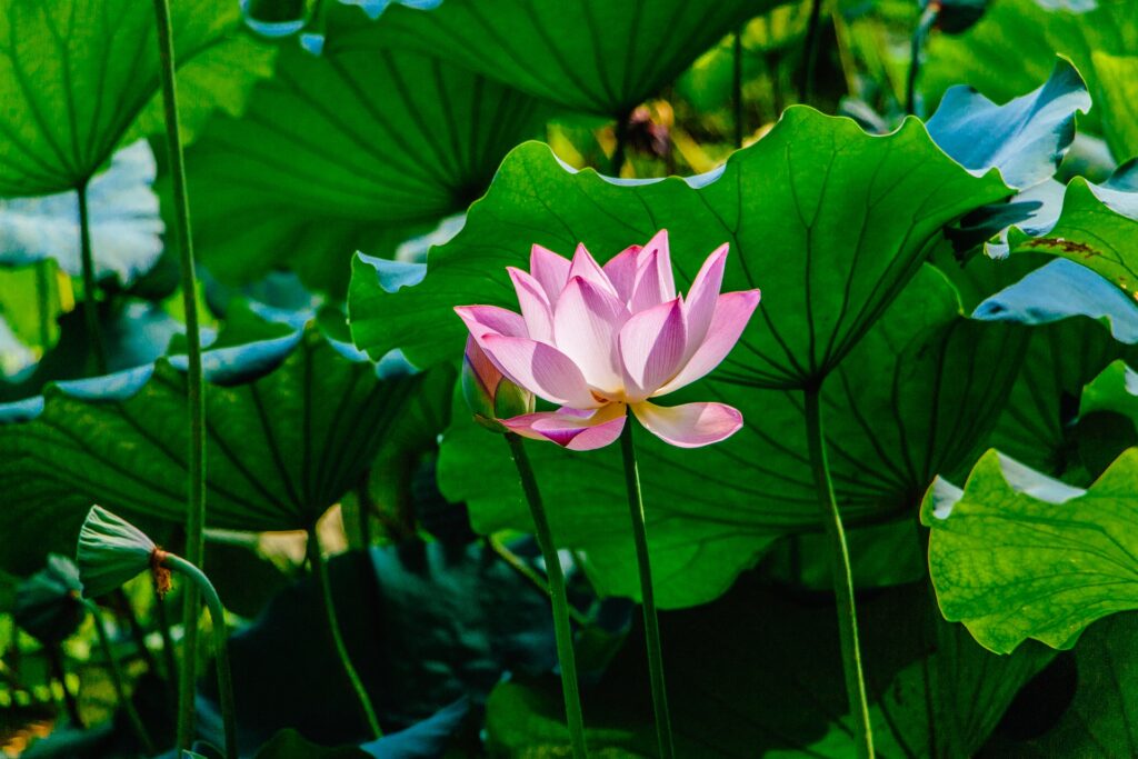
The picture below was provided by the client as a reference. They needed it to be bold and have the brand’s name in Gujarati.
The new logo has to be Elegant and Bold.
To reach the outcome of the logo design, it was crucial to understand the brief and break it down into the simplest form to draw in elements that would be relevant to the design.
Apart from making it visually aesthetic, the design has to have an impact and a strong recall for it to stand apart from the crowd which meant a need for market research was necessary.
Competitor Research
Before you start coming up with ideas and sketches, it’s important to do some market research. This helps you see what similar brands are up to, so you can learn from their successes and mistakes. Hari Group focuses on “Elegance” and “Impact,” and here are a few competitors in Gujarat.

Initial Sketching
Apart from making it visually aesthetic, the design has to have an impact and a strong recall for it to stand apart from the crowd which meant a need for market research was necessary.
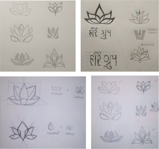
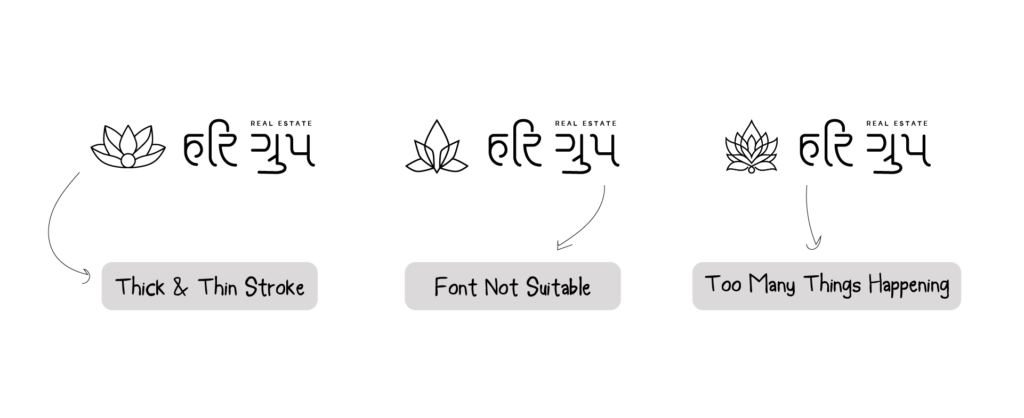
Back to Sketching
Now we know the issues in the initial sketches after vectorizing them. To make the necessary corrections, we take note of the issues and resolve them one by one by working on the ‘Lotus’ and typography.
The Concept
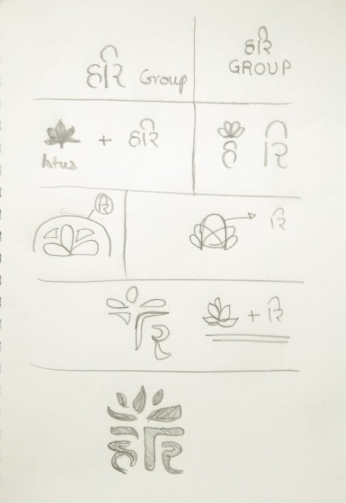
The design process includes sketching as the primary step for sketching all the ideas on paper.
Incorporating the lotus with the Gujarati word was an idea that struck me after observing a typographic error in one of my sketches and I immediately sketched it out.
Typography Exploration
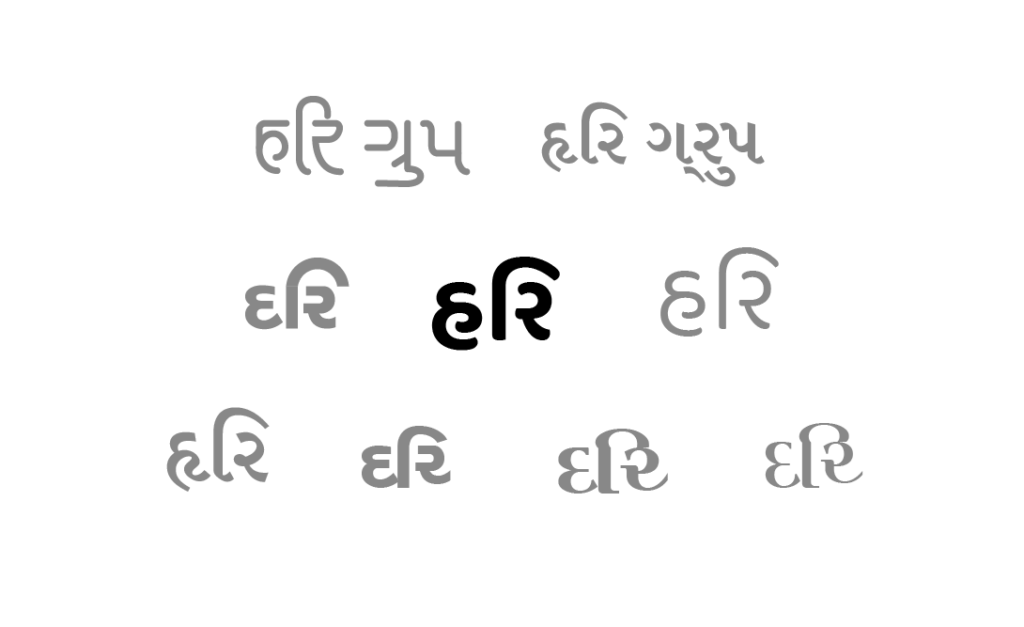
In this stage, it was a lengthy process going back and forth with fonts to use. The main challenge was to have a suitable font for the brand’s identity but in a Gujarati script. There were plenty of Devnagri Fonts to use but none seemed to match the requirement.
I even sketched some typography for the brand name to let the ideas flow. The font selected for the brand was – Baloo Bhai 2 – A Gujarati typesetting font.
Symbol Mark Exploration
The most suitable symbol for “Hari” would be a lotus. It is seen as a symbol of purity, spiritual enlightenment, and rebirth. Fitting for people who wish to move to a new home with uplifting energy.

Colour Palette
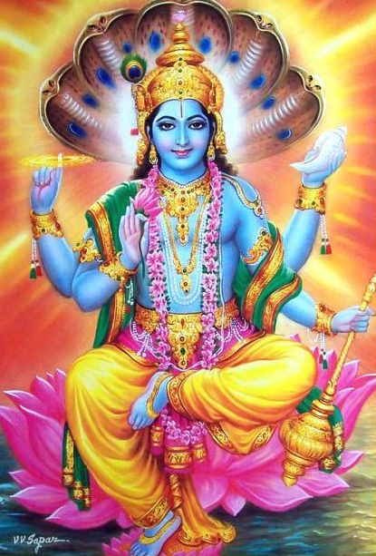
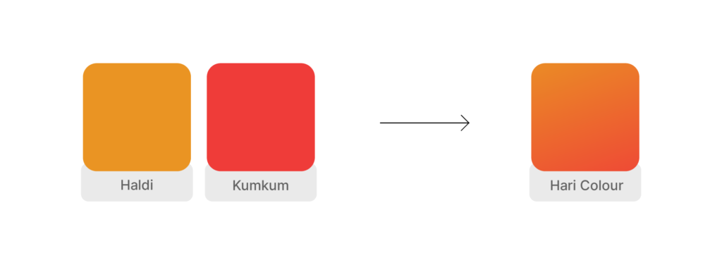
Given the client’s desire to highlight the auspicious lotus and the name ‘Hari,’ which carries the significance of Lord Vishnu, I found inspiration in the idea of using the Haldi-Kumkum combination as our colour palette.
With the brand’s distinct personality characterized by boldness and warmth, coupled with a touch of luxury, the choice became clear: a gradient merging Haldi and Kumkum shades, now fondly referred to as the ‘Hari Colour.’ This decision not only captures the essence of the brand but also infuses its identity with a unique vibrancy.

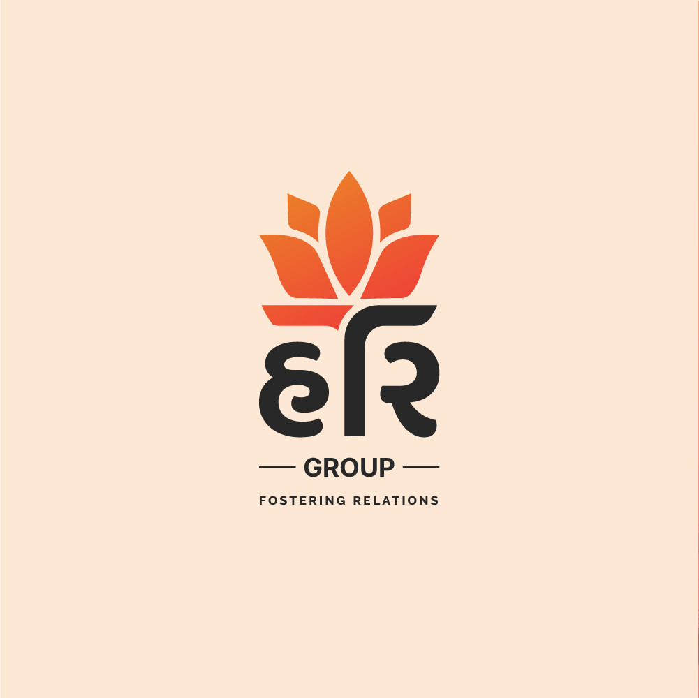
Primary Lockup

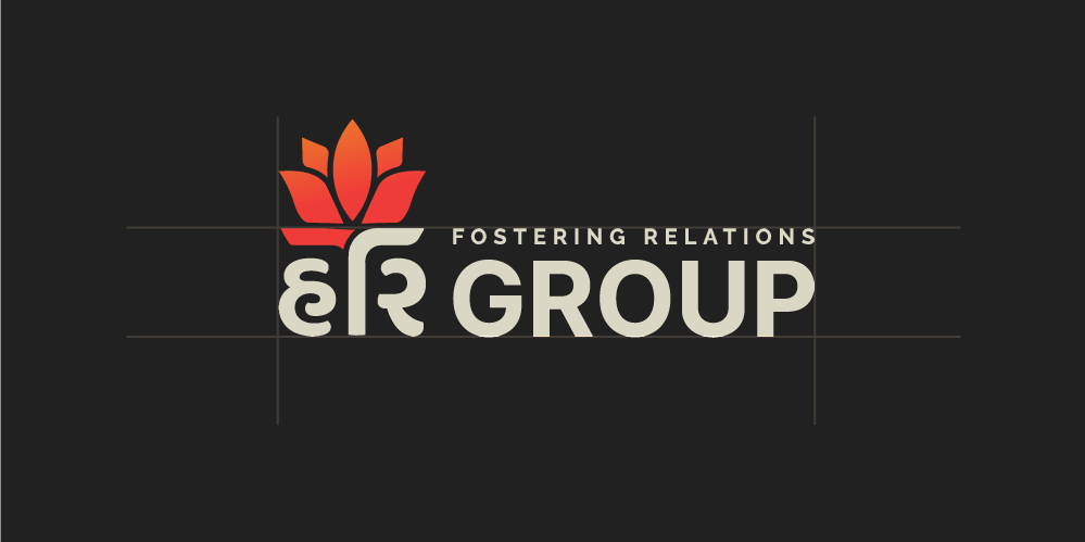
Secondary Lockup



A logo isn’t just a picture – it’s the brand’s heart and soul made visible.
Quoted by Your Friendly Neighbourhood Designer :”)
Conclusion
As we reach the end of this logo design adventure, I can’t help but feel a real sense of satisfaction. Watching the transformation from the initial idea to the final design has been nothing short of awesome.
We’ve managed to distil Hari Group’s brand personality into this visual anchor that’s not only catchy but also incredibly adaptable. The insights and suggestions made by the client along the way truly shaped the outcome in the best possible way.
Big thanks for letting me be a part of this creative venture, and here’s to your brand embracing its new look and journey ahead!
