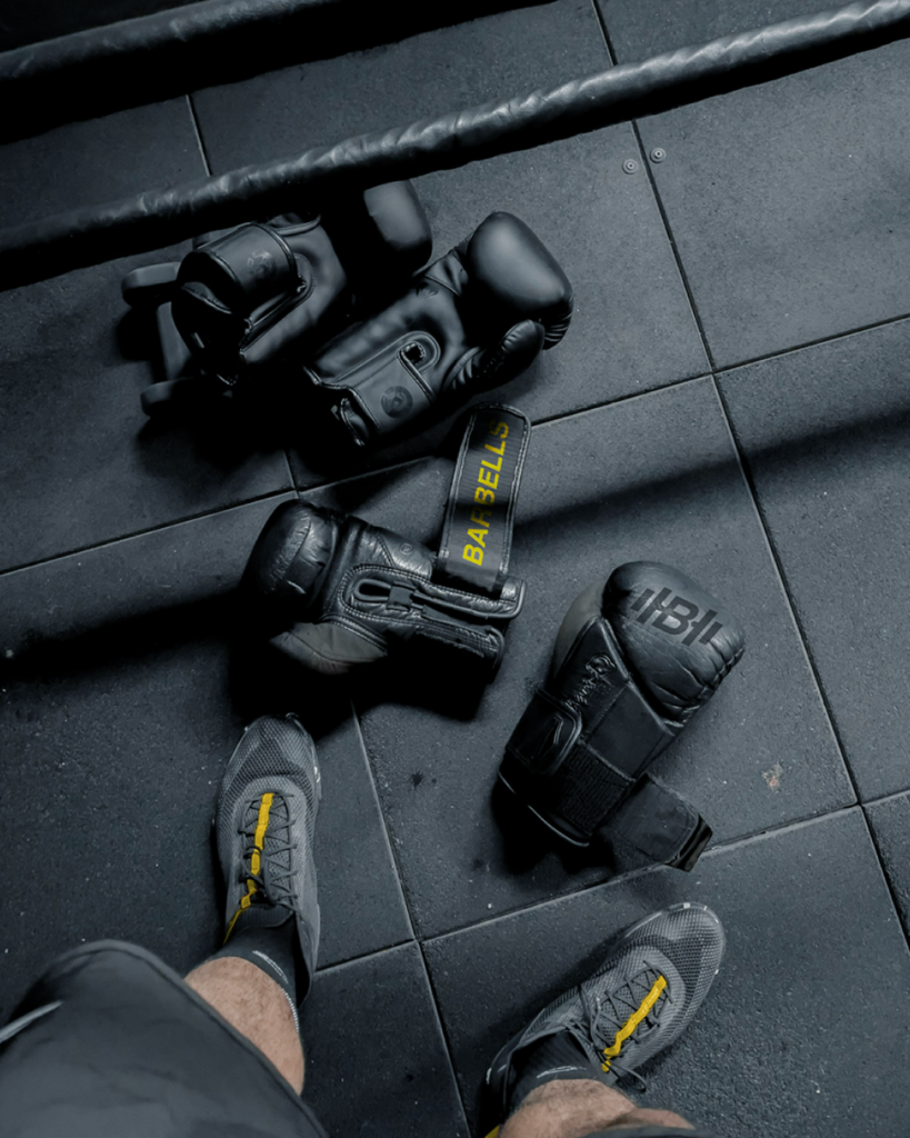
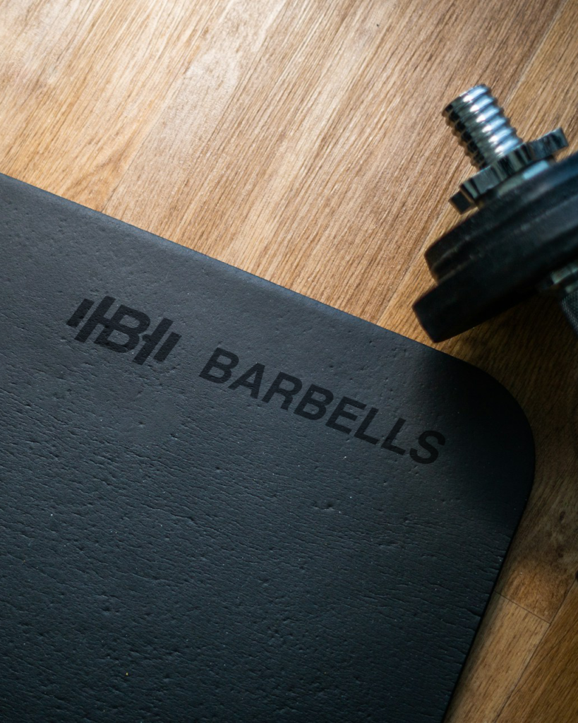
Barbells is a brand based in the UK that elevates the fitness journey with premium equipment and apparel worldwide. They aspire to transform their audience’s workout experience with products designed for athletes and fitness enthusiasts who are fearless and go-getters.
“Fitness and sports are for everyone from any background and level of fitness. I want customers to feel included, heard, energised, and empowered through interactions from the website to social media.”
-Alex Jan Lee, Founder, Barbells
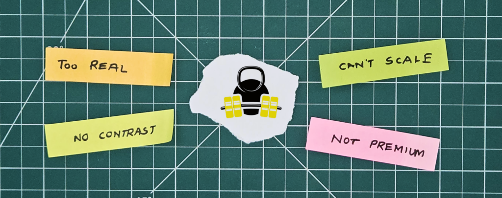
The existing Logo mark needs to change.
These are the qualities that Barbells aspires to invoke in their target audience. However, with the existing logo mark, it wasn’t easy to step foot in the premium category of the market. There is a need for the logo mark to be bold, sharp and timeless.

Proposed concepts that are timeless & minimal.
The logo needs to be scalable and a mark of action that would speak for itself in various scenarios and not be as abstract as the proposed marks.

To make a bold statement, the eternal combo of black and white with a bright yellow to inspire, give hope, and give energy.

The “B” of Barbells was taken as the base integrated with the double strokes on either side symbolising the weights.


A consistent brand presence is essential to building reliability and familiarity among the people.

